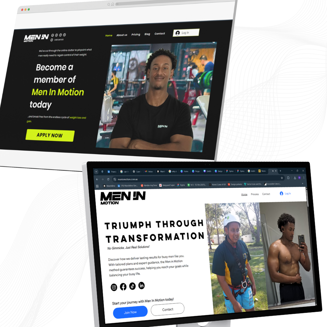
Men in Motion
Men in Motion is a fitness program for middle aged men who want to get back in shape and take control of their health. It speaks to the real challenges men face at this stage of life – busy schedules, low energy, and physical changes – and offers a clear, simple path forward. The focus is on practical habits, efficient training, and long term results without giving up the things that make life enjoyable.
The goal was to rebuild the website and present the business in a professional light so it attracts serious clients and earns trust right away.
-
UX/UI Designer
-
3 Months
Problem
The old Men in Motion site didn’t connect with its audience.
Middle-aged men who’ve gained weight want something simple to get back in shape. The design looked dated, colours were off, and there was little proof the program works.
It lacked a sense of support, community and proof, which is vital for retention.
The owner wanted to build community, but the members page was hard to use and subscription management was a hassle.
Overall, the site failed to deliver a clear, easy, time-efficient experience.
Solution
Redesign for clarity and trust:
Visuals/tone: modern, uncluttered with a neutral, approachable palette.
Messaging: concise benefit-driven copy.
Proof: clear testimonials, before/after photos, short outcome metrics.
Members area: simplified navigation and obvious subscription controls
Onboarding: brief guided sign‑up and a clear starter plan to begin immediately.
Result: a focused, user‑centric site delivering fast, practical, trustworthy support for men who want efficient, effective results.
Before designing i gotta do some things:
To make sure the new design actually works, we’ll do a few things:
Get real feedback from the guys it’s made for by testing the new site with them.
Try out different versions of important stuff like buttons and subscription steps to see what gets better results. (A/B Testing)
Keep an eye on numbers like how many people leave right away and how many actually sign up. (Bounce rate vs conversions)
Ask users straight up if they’re happy with the changes.
Doing this will help us make sure the site does what it’s supposed to and helps the business grow.
Research before design
Before I started designing, I had a talk with the Men in Motion owner to get a clear picture of the business. He shared some useful info that will help us measure how well things go later.
“I’d love to have someone have a look at it, i just think that a revamp would really change my business and get quality customers”
“My competitors just look so much better online, especially given the target audience im going for, having a website that older men can have a look at i feel would really tip them over the edge when choosing to go with me or a competitor.”
“The site’s easy to use and the membership details are straightforward, which is good. But honestly, it’s not grabbing people or making them want to join.”
“The colours don’t feel right anymore, and the login button up top is too plain. Also, the text being centred makes it harder to read, and some stuff in the footer just doesn’t belong.”
Target User
DEMOGRAPHIC
Name: John
Age: 45
Occupation: Office Worker / Construction Worker
Family Status: Married with kids
Income: Middle income, works a 9-5 or 7-4 job
GOALS AND DREAMS
Primary Goal: Lose weight and improve health
Secondary Goal: Feel more energetic, improve physical appearance, and regain confidence
Dream Outcome: Get back to a healthy weight, feel lighter and more agile, and reduce dependence on medication.
CHALLENGES AND PAIN POINTS
Discipline: John finds it difficult to stay consistent with a weight loss plan, often falling off track.
Lack of Time: With a busy work schedule, he struggles to find time for exercise or preparing healthy meals.
PASSIONS AND INTERESTS
Passions: Sports, family time, a love of beer, and enjoying his downtime.
Media Consumption: Sports betting sites, follows NRL/NBA news, shops at Bunnings or trade stores, and participates in work and trade-related Facebook groups.
What are trying to do (simplfied)
GOAL 1
Our users want something simple and efficient that fits into a busy life and helps them make progress without any extra fuss.
GOAL 2
Losing weight is part of the goal, but the real drive is feeling healthier, ultimately needing less medication, having more stamina, and getting confidence back.

Design Process
Early ideation, low -mid fidelity prototypes, User feedback and High fidelity prototype
What didn’t work on the current website?
“The website feels a bit dated. The dark color scheme isn’t very inviting. I think something lighter would be better."
“I wasn’t immediately sure what the brand was about. It seems like it’s focused on fitness, but that could be clearer."
“There are no testimonials. Maybe include photos or videos to make them more convincing."
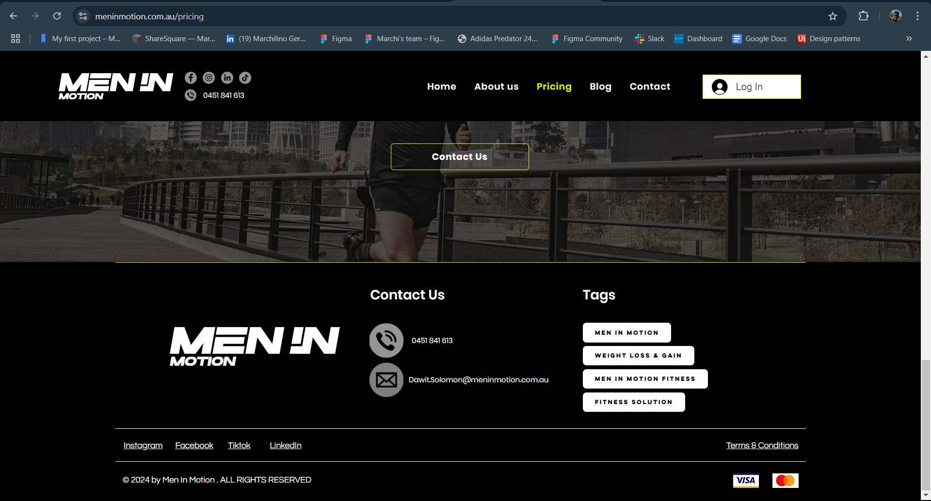
“The footer is okay, but it’s not very exciting. It could use some quick links or maybe social media icons."
"Enhance visual design with stronger branding, modern typography, and improved colour contrast for a professional look."
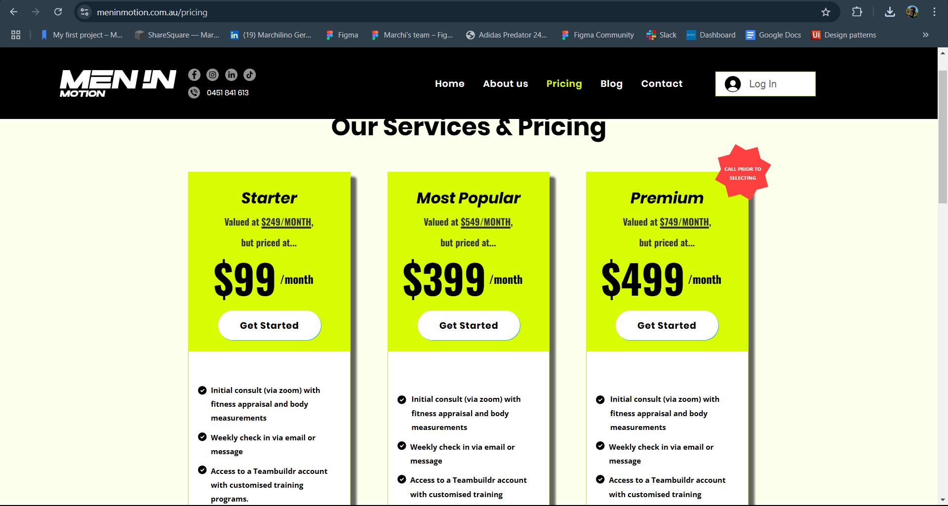
"Highlight the most popular plan to guide user choices effectively."
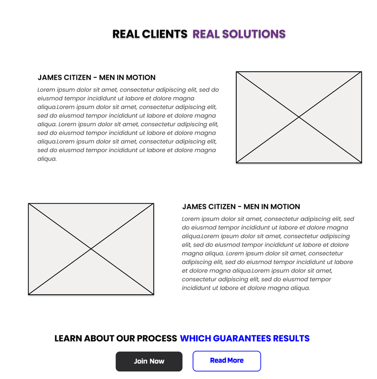
“Put in some social proof, such as testimonials or success stories, to build trust and credibility."
"Optimise mobile responsiveness for a polished experience across devices."
PHASE 1: REVAMPING USING CRITISM
“The dark color scheme isn’t very inviting. I think something lighter would be better."
After discussions with the client, we collectively decided to implement a new colour scheme consisting of Black (#000000), Classic White (#FFFFFF), Facebook Blue (#1A6AFF), and Grey (#999A97). The goal was to achieve a minimalistic design while ensuring the content remains impactful and accessible. Emphasis was placed on utilising negative space effectively to enhance the overall aesthetic and readability.
"I wasn’t immediately sure what the brand was about. It seems like it’s focused on fitness, but that could be clearer."
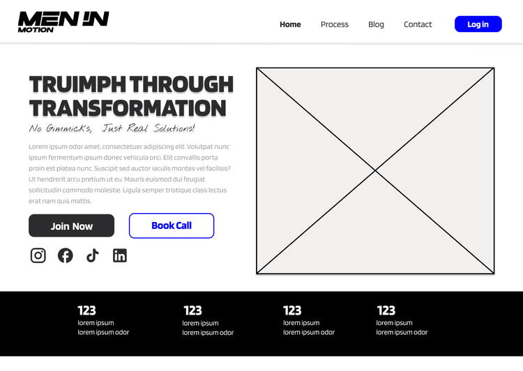
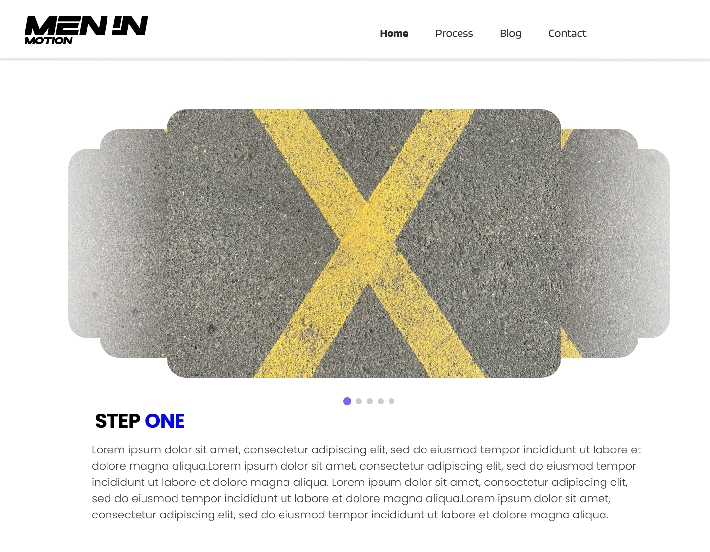
When discussing this with the client, we talked about how to make sure the website connects with potential leads. The client pointed out that visitors should already have a basic understanding of the brand. While I agreed, I suggested adding a hero section that works for both new visitors, by explaining what the brand is about—and returning users, by offering content that keeps them engaged.
"Enhance visual design with stronger branding, modern typography, and improved colour contrast for a professional look."
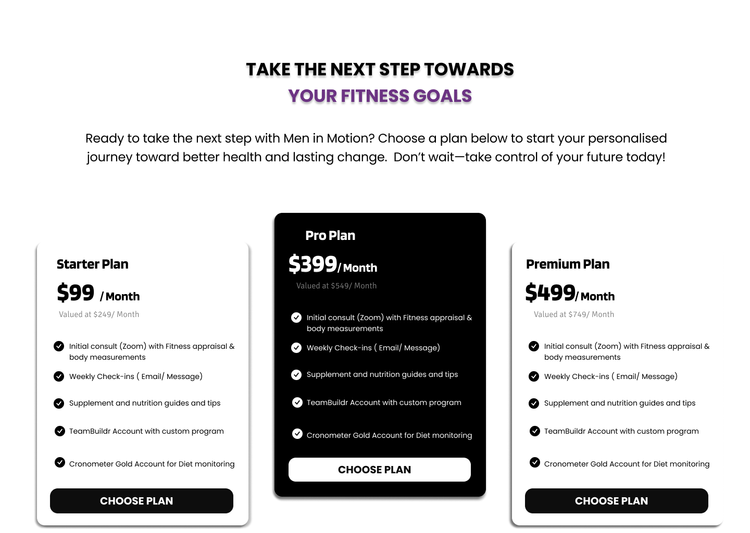
"Highlight the most popular plan to guide user choices effectively."
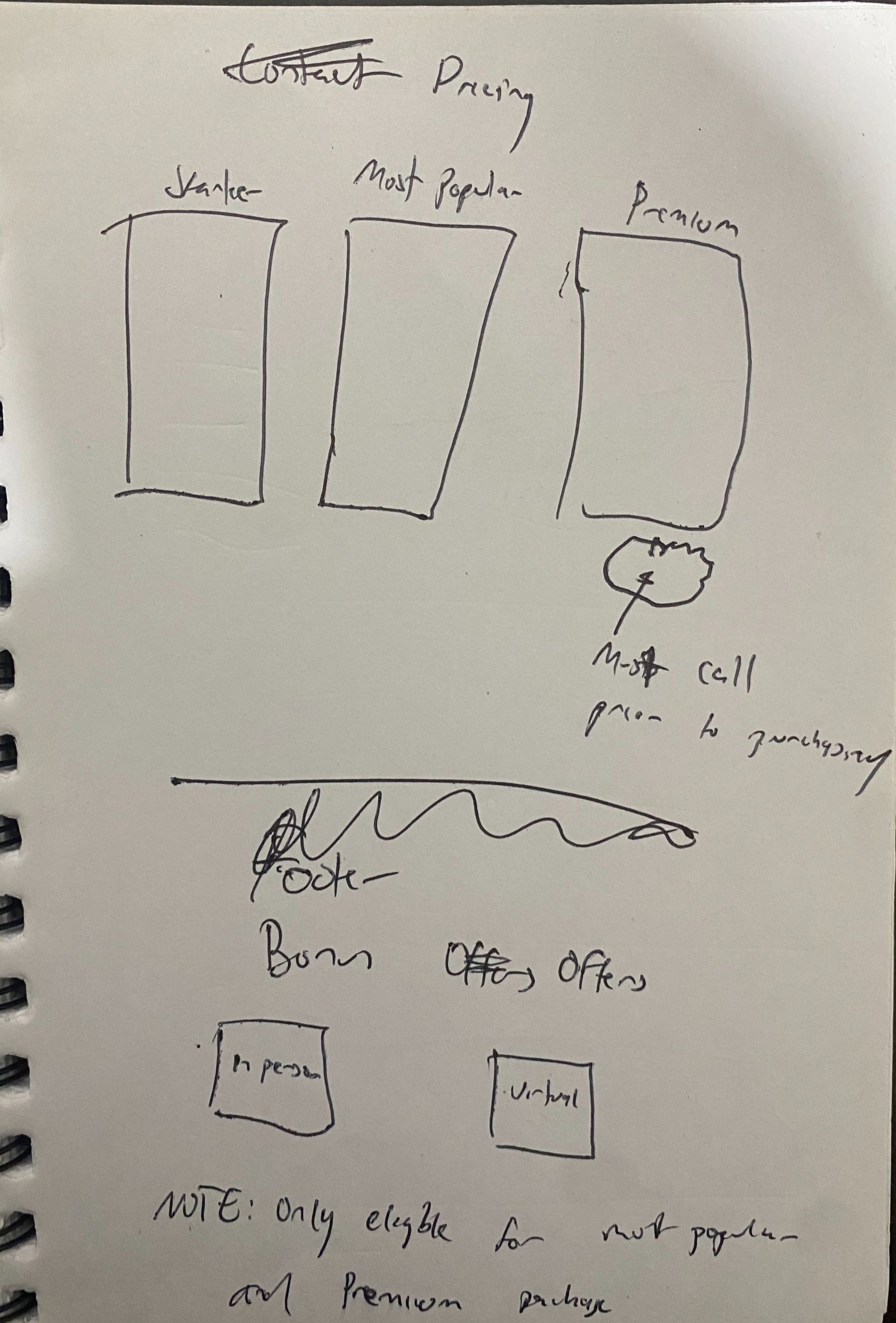
The client aimed to implement the "decoy method" to attract potential leads to a specific plan. To complement this strategy, we leveraged the Isolation Effect, making the plan visually distinct to capture attention. This combination of the decoy and Von Restorff effects was designed to effectively drive engagement and boost conversions.
PHASE 2: COMPETITOR ANALYSIS:
WHAT MAKES THEM SO MUCH BETTER?
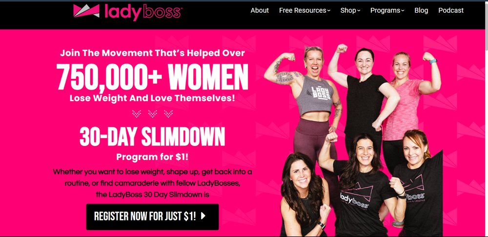
This design captures attention with a bold headline, motivational message, and vibrant pink palette. Smiling, strong women evoke community and empowerment. The clear layout guides users easily, while the standout call-to-action highlights affordability, driving engagement. Subtle patterns and clean typography boost visual appeal without clutter.
wakeupwarrior.com
The website immediately grabs attention with a dynamic autoplay video showcasing its mobile platform and features, engaging viewers right from the start. Below the video, a bold call-to-action highlights that over 11,308 people have already taken part in the transformative challenge, urging visitors to “Get Started Now!” The visually striking design, combined with the compelling statistics and strong call-to-action, creates a sense of urgency and inspiration for users to join.
physique factory
This testimonial blends striking before-and-after photos with a personal story to engage and build trust. It highlights a clear result ("lost 45kgs in 39 weeks") and showcases the program’s guidance on diet, training, and social life. The authentic endorsement and conversational tone inspire others to take action.
ladyboss.com
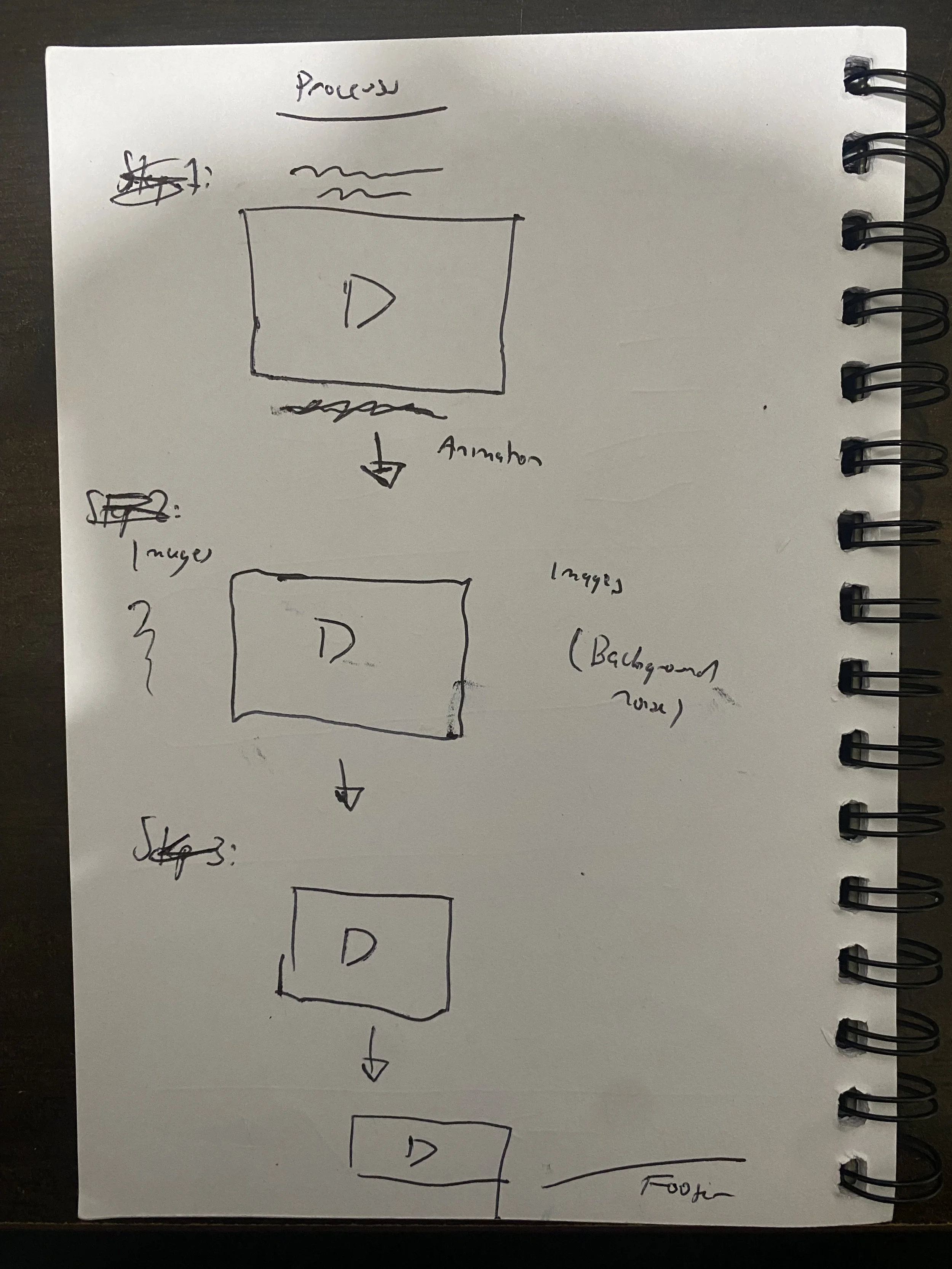
Phase 3: low & mid fidelity mockups
The unseen side of projects
This process took a-lot of time with all the back-and-forth on designs and website ideas. I’ve attached my Figma file that has everything I worked on; basically how the site looked before the final version. It’s nothing fancy, just raw and unfiltered, showing that design isn’t always about looking pretty. There’s a process
Final Product
Men in Motion is a fitness program tailored for middle-aged men seeking to regain control over their health and fitness. The program understands the unique challenges this demographic faces, offering a straightforward, goal-oriented approach that fits seamlessly into busy lives. By focusing on convenience, efficiency, and lasting lifestyle changes, Men in Motion empowers men to achieve sustainable results without sacrificing enjoyment in life. With the changes made to the men in motion brand and website we have positively impacted the lives of many different men who seek to regain their health and fitness
